Creative Artists: Geoffrey Johnson

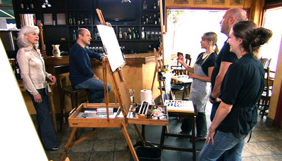
In an attempt to be more creative with my painting, I am doing a fair amount of research and web browsing to discover something that will spark new ideas and concepts. Over the next few months I will be exploring and experimenting with new concepts as well as keep up my normal painting schedule. I will post the things I find interesting along the way.


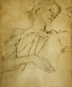
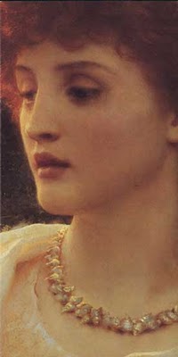
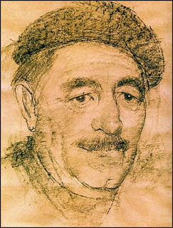
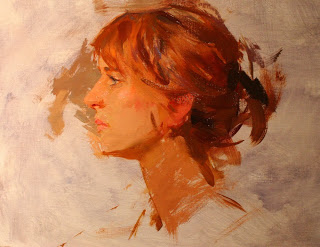
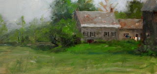
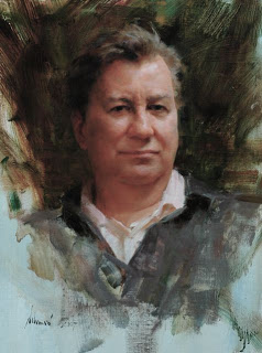
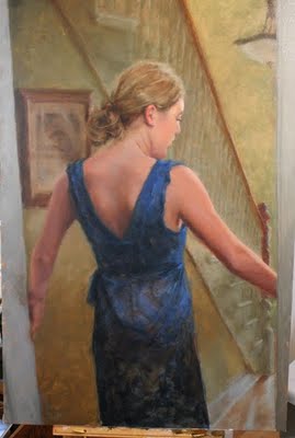
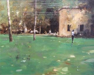
When first stumbling on this concept of creative representationalism, one artist in particular came immediately to mind. Geoffrey Johnson, born in 1965, is a graduate of the Pennsylvania Academy, the first and oldest art school in the US, and has been selling out his shows for years now.


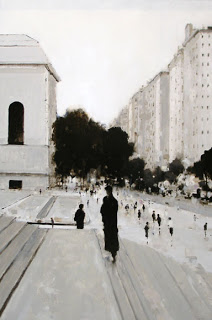
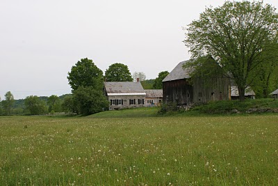
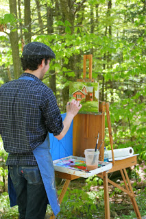
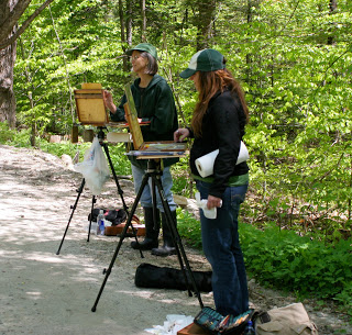
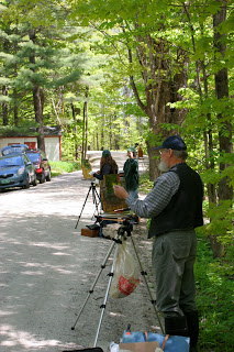
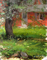
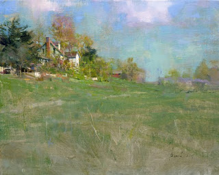
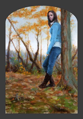
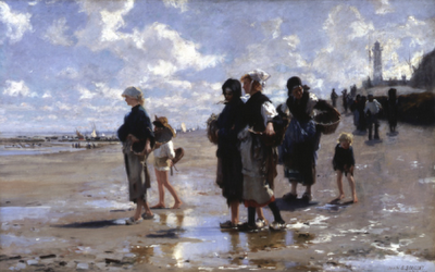
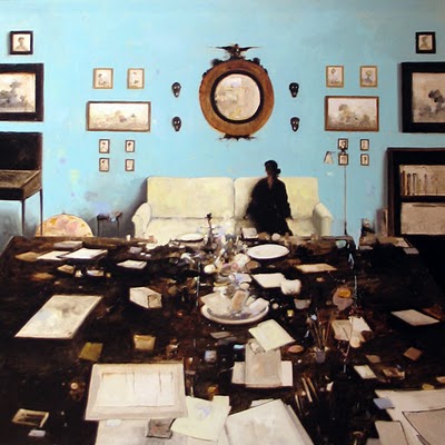
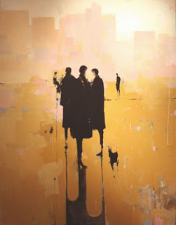
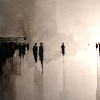
Born in North Carolina and now I believe living in Georgia, Geoffery has an extremely compelling style that fuses still urban landscapes with the movement of figures and crowds. He began his career by painting landscapes much like the one below and eventually began incorporating figures which were soon coupled with monochromatic urban scenes, creating a style and concept that is all his own. Geoffrey's work does border the fine line between aesthetic and representational art, but I doubt there is a collector or gallery that wouldn't love to have one of his works in their collection.


Check out more of Geoffrey's work through his galleries: Principal GalleryShain Gallery, & Hubert Gallery


More thoughts on creative art:
I believe the art community, and myself, should limit ourselves to a strict criteria when it comes to creativity. It's easy to see that modern art has opened the doors to just about any material and technique. While this might make it easy to develop something unique, it might not be creative. Anyone can strap some neon lights and paint on a canvas, or drip paint from a pendulum suspended over a canvas, but that doesn't say anything about our past as painters,  our skill and technique, or the exact feeling and message that we are trying to convey (unless it's chaos). If we limit ourselves to classical techniques and materials, we can insure that our work will stand upon the shoulders of the old masters, as well as the test of time.


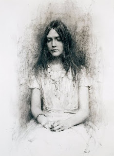
Brad Kunkle's work (as described in the post below) uses gold leaf, a technique that was used in the Egyptian pyramids and ancient Rome. The use of gold and oil paint together has been used for centuries, and Brad isn't the only contemporary artist doing it, but he was able to add his own creativity and a high level of skill to create something entirely new.


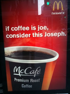
Graphic designers and agencies do this every day, and in some cases the best advertisements take a unique spin on something common or classical (I saw the below Billboard for McDonalds in my town the other day . . . It's a good example). Imagine if the marketing world took hold of the concepts of modern art, we would probably see car salesmen trying to sell cosmetics by screaming at women and slapping colorful starbursts all over. But yet we see in every makeup ad the idea of "natural" beauty and clean, soft light, as if every model is a Greek goddess (and you too is you buy the stuff).


This narrowing down of materials and techniques (which is still very broad) will produce a potential for higher creativity than would otherwise be possible, and could also gauge what is "acceptable" representational creative art. From an investment point of view, collectors are concerned with the whole gamut of art history and how an artists work fits into it. We have all seen artists fade in and out of popularity, catching the latest trend or it's resurgence. If an artists work could be in sync with the foundations of classical art, while still bringing the current world and his personal thoughts into it, then he has a much better shot of becoming a "new master".

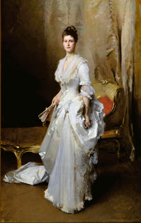
As in my past post, I don't think a painting needs to be more than paint on canvas or board, the use of other materials like gold, silver or who knows what else may be a rough road to travel. As we have seen by Geoffrey Johnson and countless other artists, creativity and sound technique is all you need to create something worth while.

Where is the Creative Art?

 Gustave Klimt

A couple weeks back, I saw posted on Facebook that it was Gustav Klimt's birthday (July 14, 1862) and it immediately made me think of the countless times that I have recently heard the comparison of contemporary artist Brad Kunkle's work to Klimts. Being very familiar with Kunkles work, I decided to learn more about Klimt to make a comparison for myself.

  Brad Reuben Kunkle

Both artists use gold leaf and oil paint together on canvas, and both focus primarily on the female figure/portrait (which is probably the most common and popular subject matter). So, past this use of gold, I really didn't see much unique similarities that would justify the hype.

The more I looked through the various paintings, the more one major thought came rushing to my mind. Whether you like their works, or think they are similar, I think the greatest point is that they both are doing more than just painting reality, they have gone a step further and added creativity. Design, simplicity, materials, composition, abstraction . . . these are all elements within their work, and also considerations and judgments that they planned for well before starting to paint.

 Gustave Klimt

I am a firm believer that a painting (or "art") needs to be nothing more than a glimpse of the beauty in our world. Whether an exact representation of the subject or the artists judgment on what elements are specifically important. Both of these general approaches encompass the majority of paintings in the "non-modern" art world and I'm happy to spend hours looking and creating them. But I now see that although the majority of these types of artistic works are filled with great brushwork and exquisite renderings, they may lack the creativity or maybe even better said, the potential for creativity that limits them from being ageless masterpieces.

   Brad Reuben Kunkle

This creative touch that is so apparent in Kunkle's work (and so non-existent in most of today's popular representational masters) has really got me thinking, and a bit convicted, that I could go further with my art and pay more attention on the design and concept of a piece. I bet that if artists took the time to be more creative, we would see greater individuality and perhaps a monumental new era that could stand up to the 19th century masters or in some respects the Modern Art age that predominated the 20th century and today.

 Gustave Klimt

The shift to be more creative in the late 19th century (that Klimt was clearly a part of) was taken to the extreme and spawned Modern art. Losing almost all technique and natural beauty, modern art became only creativity and the striving need for something unique and shocking. Maybe this time around, with the right combination of technique and creativity, and maybe with the help of artist like Brad Kunkle, we can actually get it right.

 Gustave Klimt

  Brad Reuben Kunkle

Note: In the late 19th century, Klimt was highly rejected for his paintings. The main cause of this was for his erotic and overtly nude pieces. I am personally discouraged by this strange association with nudity and sexuality to highly creative art. I feel that these additions pushed art toward the shocking and obscene that modernism was hungry for. This ever growing rise of nudity in both modern, and in some cases, classical art is desensitizing our culture and instead of conveying a new and undiscovered beauty, it is stripping beauty away from intimacy and personal relationships and slapping it onto canvases to be shared with the world. This is strictly my own opinion, but for fear of adding to the noise and problem, I err on the side of caution and stay away from it in my subject matter.

Rebecca, 9x14

Just finished this little painting of my sister-in-law Rebecca. I've been working on a huge painting of her for a long time now and I need to keep taking breaks from it so I don't go crazy. I think this little painting will act as a good study for me, there were some problems that I solved that should help with the big one . . . it's always hard for me to play around, or try out different things on a big painting. I get scared of building up to much paint, or wasting a big canvas, but with these little paintings, I could care less if it doesn't work out and I can always just throw them away if I'm not happy. I wish I could get my head to think like that for the big ones too, I bet the outcomes would be even better (and quicker).
 
I was planning on taking more photos throughout the painting, but it moved pretty fast so I only got three.


Inspiration: Sir Frank Dicksee

I just stumbled on a collection of paintings by Sir Francis Dicksee and saw some really great paintings that I was completely unaware of. I didn't know much about him or his work, and previously thought of him as a genre painter and member of the pre-raphaelite movement. Upon reading his biography, he apparently only has a loose association with the movement – mostly because of his general style and popular genre paintings like the Romeo & Juliet or Othelo works that you most likely have seen.


Francis Bernard Dicksee was born in London, 1853. He studied in the studio of his father, Thomas Francis Dicksee, who painted portraits and historical genre scenes; he then enrolled at the Royal Academy in 1870, was elected RA in 1891, and became it's president in 1924. Through some early studies with Henry Holiday, a designer of stained glass, Dicksee grew to enjoy the decorative and detailed aspects of painting. With the further influences of Fredric Leighton and G.F. Watts, Dicksee filled his wonderful compositions with orchestrations of color and elaborate detail.


It's because of this attention to composition, detail, and decoration, that I find it an inspiration for my own work. I can't imagine the amount of time and devotion that went into these paintings. I consider them masterpieces and I hope to someday create works that warrant the same title. Although I personally like a loose, painterly style, I admire these works very much, and feel that they still have plenty of exquisite brush work that is generally unnoticeable in much of today's "classicism" and photo realism styles.


Other interesting historical notes is that his sister Margaret Isabel and brother Herbert Thomas were also painters, along with his uncle John Robert Dicksee and his aforementioned father.

Sir Frank Dicksee passed away suddenly on the 17th of October 1928.


 For more on Dicksee, check out the Art Renewal Center info

Wet Paint: Repose #1

Just finished this little painting. Been wanting to do it for a while now, but kept feeling like the larger paintings should come first. This is the kinda stuff I really love to do and I think I'm going to bust out a couple more before I embark on some more bigger canvases.

Max Turner


Max Turner is an instructor at the California Art Institute; other faculty members include artists like Tony Pro, Glen Orbik, Ryan Wurmser, and many other greats. I first saw Max's work several years ago in his self-published book Faces. When looking at his charcoal head studies, I instantly thought they were reminiscent of Nicolai Fechin.

Max's world is all about faces. As a child, he would rummage through the trash, looking for the popular fashion magazines of the day, just to get a glimpse of the latest cover illustrations by Harrison Fisher or Jon Whitcomb. He was born in the small, and art baron, town of Bingham Canyon, Utah, and was a soldier in World War II, a printer, machinist, foundry worker, and eventually an instructor, artist, and sculptor.


There isn't much about Max or his work on the web, but after seeing the below photo on Tony Pro's Facebook profile, I was reminded of his drawings and set out to find his book and to see more of his work. His books, which now include Faces2, and Figures & Faces are not available through any means other than from him directly.


Without knowing any of his contact info, I stumbled across a site called Bonanzle which was selling some drawings and paintings under the name Max Turner. After contacting the seller, I found out that it was actually Max himself and I was able to purchase a book and a head study from him. The below image is a photo taken of my new drawing which I just got put in a frame.


It amazes me that Max, along with probably hundreds of other great artists are fairly unknown and unrecognized for their work. It may be the cost of being a teacher, and not a gallery artist, and perhaps they just live on through their students (Tony Pro, Jeremy Lipking, Aaron Westerberg and others in Max's case), but in any event, I wish they were more known and rewarded.

For me, my most influential teacher in art school was Brian Jekel. I can't imagine the sacrifices he has made just so young artists like myself could be set on the right path . . . I hope to someday make him and my other instructors proud by becoming the type of artist they dream of for their students.

Jeremy Lipking Demo


I went to Arcadia Gallery this Saturday to watch a demo by Jeremy Lipking. There were at least 50 people crammed into the gallery for the 2 hour demo, and after almost the first hour being taken up by set-up, discussion, and the initial stages of painting, Jeremy was still able to get incredibly far with it (The photo below is the final painting).


In the crowd I also saw Michael Klein, Dorian Vallejo, and several other artists. If you haven't had a chance to view Lipkings current show, try and make it down to the gallery, or view the paintings at Arcadia's site by clicking the "current exhibition" link. Thanks to Steve and the rest of the team over at Arcadia for making this event possible, it was a real treat.


Painting in FAV 15% in Fine Art Studio competition

My painting July Serenade was a top 15% finalist in the Fine Art Studio's online painting competition. Check out all the great paintings here. Congratulations to the winner,  Aaron Westerberg, with his painting Going Out. The Judge was William Wray, a really cool urban landscape painter that is also the illustrator responsible for that awesome Ren & Stimpy style and those "gross" detailed illustrations that I always loved seeing on the show.

Aaron Westerberg

William Wray

Bill Wray (He goes by Bill as an illustrator)

Day in Vermont


I had the privilege and honor of spending this past Monday up in Vermont with some great painters (and ticks, mosquitoes, and black flies).

I joined Daniel Keys, Michelle Dunaway, and Putney Painters: Rosemary Ladd, John Smith, and Lori Woodward Simons in the town of Ludlow to paint an amazing apple tree in bloom, and then later in the day, a picture perfect farm (with clothes on the line!). Throw in a little lunch and antiquing for future still life elements, and it was just about a perfect art day.


Daniel Keys was up giving a workshop at the Village Arts of Putney, and from what I heard and saw, anyone would benefit from the insights and techniques of quite possibly the next big "master". Keep an eye on this guy . . . his amazing still life's are just the beginning.


Michelle Dunaway was most recently a finalist at the Portrait Society of America's annual competition, and her body of work is truly some great inspiration for me (and for you) as I try and focus on more figurative works. (that's Rosemary Ladd standing next to Michelle above)


Above is all of us lined up along the road painting the large apple tree, and below are the two studies that I painted (about an hour and a half each), definitely rough and not frame worthy, but hopefully they are either a good start or color reference for some final paintings.


Schmid on patience


I have been working on a very large painting for just about 3 months now. I am determined to get it just right, and I'm going insane, painting and re-painting one section of the face in particular for the last month and a half. I only spend about 8 hours a week on it and I'm working at a crawling pace to make sure I'm doing it right. Before this crawling pace, I had re-painted the head about 20 times, expecting that each time I scrapped it down and re-painted it, the right strokes would just flow out as easily as other parts of the painting.


It for some reason made me think of Richard Schmid and his writing about patience. He touches on it lightly in his book Alla Prima, but when grazing through the book, I couldn't find what I was looking for.

After some searching, I found it in a word document I made a few years ago compiling Richard's old "Notes from the Hayloft" that he used to write on an older version of his website.
. . . some measure of perseverance and tenacity is necessary at various (and often unpredictable) times throughout a painting. Sometimes things go smoothly and I can simply enjoy what I am doing. Other times I slam into a problem and the only way out is to slow down to a crawl, concentrate until my teeth hurt, and bring every faculty I have to bear on getting exactly what I want, no matter how long it takes. It's more than simple endurance. It's real mental effort and the inspiration fairy has yet to appear at such times waving her magic wand of easy solutions. I alone must solve my problem. I have to clear my mind of everything else, think hard, analyze, explore my options, plan a strategy for the immediate situation, and then do whatever it takes. Sometimes it means scraping off what I have done and starting over again and again.


It looks like I should finish the painting sometime in the next week or two and I'll be so happy when it's done. For the rest of the spring, I will be doing some smaller paintings and some plein air . . . which I can't wait for.

If your interested in Schmid's old "Notes from the Hayloft" check out the wayback machine and click through the old versions of his site: http://web.archive.org/web/*/http://richardschmid.com


Harold Speed on Modern Art

I am slowly working my way through Harold Speed's book, Oil Painting Techniques And Materials. I'm only through the first chapter but there are some great quotes and content that I want to share before I forget them.


I have never been fond of swearing (most likely because it was never used and punishable within my home growing up) and Harold, while talking about modern art, tied the two together so well. Hopefully the below quote will make you think twice about swearing, or encourage you to expand your painting "vocabulary" (or if necessary, both).

The use of swear words by ignorant people is quite excusable, because they have not the wit to use, or the knowledge of, just those words which would forcefully express what they want to say. And failing to give their expression the force they desire by the legitimate use of words, they throw in some nasty expression of entirely alien association, like a bad smell, but calculated to give a shock; which gives them the satisfaction of having made a forceful remark. The violent use of colours and forms adopted by much so-called advanced art nowadays, is just like these swear words. They want to create a sensation, and not having the wit to use the wonderful instruments of expression that are at the disposal of the modern artist who is prepared to follow the straight and narrow way, they would destroy the restraints of tradition and rush to the use of swearing yellows and screeching reds, of clashing lines and jarring planes, in lieu of anything really forceful to say.


Making Oil Paint

I mainly use Gamblin and Winsor & Newton oil paints (I also use some Rembrandt, but the quality is noticeably different). I recently saw a Discovery channel special on the making of Gamblin paints, and it got me wondering if Winsor & Newton manufactures paint the exact same way. Luckily, I found on YouTube an episode of "How it's Made" (another Discovery channel show) featuring the Winsor & Newton process. After watching both, it is clear that although the process of making paint is the same, it seems that Winsor & Newton focuses much more on exactness, quality control, and lab testing. This is probably tied closely with the fact that Winsor & Newton is a much larger company and has a reputation as the "best" oil paint to keep up. From a personal, hands-on point of view, I like each brand for their own qualities. Gamblin has a generally fantastic consistency and transparency, but Winsor & Newton's colors seem purer while the consistency is a little thicker with less transparent in some cases (which may be tied to the actual pigment, not the manufacturing process).


To really study the options and differences between these brands, I've ordered their hand-painted color charts (which I honestly didn't know existed). This way I can put the swatches side-by-side and make sure I'm choosing the right brand for the right color.

For the Winsor & Newton click here
And for Gamblin, go here and at the bottom you can send an email requesting one.

Classical Painting Atelier


I recently received Juliette Aristides new book, Classical Painting Atelier. Juliette taught with Jacob Collins at the National Academy in New York, and then became a founding member of the Water Street Studio. She currently runs her own atelier (ăt'l-yā'), Aristides Classical Atelier in Seattle, and has proven herself a driving force in the resurgence of the classical movement.

As best I can describe, this book is not a "how-to paint" book, but more of a how to learn how to paint. There are many short lessons throughout the book that walk you through some of the key projects you would encounter in an atelier (cast drawings, master copies, monochromatic painting . . .), but other than that, the book simply outlines principles and concepts that an artist should study. Improving your work through composition, value, color, and just hard work.


The Introduction and first section were my favorites, as it gave a history of the atelier and Juliette's personal opinions and feelings about education and the need to turn back to classical/representational art. The Composition chapter was the most detailed I have seen (although I can honestly say I haven't studied much more than the basics). She applies both mathematics and harmonies into how the masters composed their masterpieces. She also overlays these principles onto the paintings that used them. I am not a strong believer in some of these principles but I will definitely focus more on my compositions and always have it in mind while I create a new work.

Overall, a very valuable resource for my personal library. Juliette has also written a previous book, Classical Drawing Atelier, which I have now put on my book wish list.


For a more detailed review of the book, visit the Art Renewal Center

Autumn

Just finished this new painting. It's 20x30 oil on linen and is actually a section of our backyard (I left out the ugly chain-link fence and swing set!). There are a bunch of trees in our lawn, and a wooded portion just past that, which results in way to many leaves. To be completely honest, I didn't finish the raking before the snow started to fly -- I'm definitely fearing spring for that singular reason.

Because of the slightly weird composition (head so high on the canvas) this painting has an oval top to draw your eye up. Some of the bigger named artists are doing this a lot lately (Jeremy Lipking in particular) and I was pretty excited to have a chance to do this and to eventually get a cool frame.

For those who care, I also made some minor edits to the final painting of my demonstration below. Scroll down to the Part 3 to see the final version.

Richard Schmid: The Landscapes


"there is a fascination and tranquility brought about by nature . . . as close to happiness as anything I know of."

- Introduction of Richard Schmid Paints Landscapes, 1975

My wife was very good to me this Christmas and gave me the new landscape book by Richard Schmid. The book is a large, 11x14, coffee table style book with over 300 paintings and drawings.

If it hasn't been apparent yet, Richard is on the top of my "favorite artists" list. Not because he is popular or I'm trying to get on some band wagon, but because I am absolutely amazed at what he can do with paint and a brush. There are countless of his paintings that have so much reality (in some cases, beyond reality). There is so much space and depth -- a result of his exacting values and beautiful edge work. If you were to mention artists who have the best handle on color, Richard's name would come up. If you were to mention value, or drawing, or brushwork, again, his name would be one of the first mentioned. In all the areas that make a painting successful, he is a master of them. That is why I fill my shelves with his books and videos.


The Lanscapes is organized by location and season, starting in Chicago and then New York, New England, and International locations. It is light on text (I read through it in a couple hours - taking my time at each painting) but it's written very well and a pleasure to get some background behind many of his paintings. There are also several photos of him painting on location and progress photos of three or four landscapes.


If you don't have any books by Richard Schmid, get Alla Prima first, and then this one. There are hundreds of paintings that haven't really been seen before, making it an archive and history of one of our centuries great masters painting his favorite subject.


Fine Art on TV

I can honestly say, among with many other artists, that some of my first memories and desires for art came from watching it on TV. I didn't grow up in museums and galleries, or have lavish coffee table books showing the masters, my introduction to the arts came from Bob Ross and other "craft" painters on air Saturday mornings. Now, I'm in no means elevating Bob Ross's technique or saying that his landscapes are examples of exemplary art, but to a 10 year old, watching him carve out a mountain, or make glassy flat water was enough to get me excited about creating something myself. Those few sparks, along with other influences like my parents, grandparents, and school friends, are what most likely steered me toward this life I'm living.

I've always thought that art, and in particular, the making of art, is such an interesting thing, and completely different for each artist. Now a days I get my watching fix from the painting dvds of Scott Burdick, Jeremy Lipking, Burt Silverman, David Leffel, Casey Baugh, Richard Schmid, and others (My bookshelf is getting pretty full). But for those millions of average viewers and aspiring children that don't know about these "insider" videos (let alone finding the money to buy them), there still isn't much out there except for some old re-runs.

All of the above to simply say - "I think there should be more".

One glimmer of hope is a show titled "Star Portraits." This show originated from the BBC in Europe and is now airing on Bravo Canada (new and improved with a new host). Sadly I can't get this here in Connecticut, but thanks to YouTube and the rest of the internet, we can all get an episode or two. The show combines a Star personality with three portrait painters who battle it out for two weeks. In the end, the Star picks their favorite and gives some money to a charity. The viewer leaves inspired, enlightened, and very interested in next weeks show.

Here are a few links I found:

The old BBC Show: YouTube
Bravo Show: www.starportraits.ca
Trailer: YouTube

Putney Painters and Friends


This past weekend, I stopped by Susan Powell Fine Art for the reception of their current show "Putney Painters and Friends". The Putney painters, if you don't know already, are a group of painters that regularly meet and paint under the guidance of master artists Richard Schmid and his wife Nancy Guzik. I had the pleasure of meeting many putney painters and local artists -- including the amazing floral painter Kathy Anderson, and Katie Swatland, who continues to get better and better with each new work. The gallery was unbelievably packed and was a testament to not only the success of the gallery and painters it represents, but also the renewed interest in representational painting. The below paintings are a few of my favorites. Check out Susan Powell Fine art on Artnet to see the rest of the show.

Kathy Anderson
Catnip and Cosmos

Dennis Sheehan
Early Winter

Rosemary Ladd
Birch Bark Nest

John Kilroy
Next to Godliness


A Moment's Beauty


Over the past month, I have been showing some work at Beardsley Fine Art, in their "A Moment's Beauty" group show. The Reception was this past weekend, and I had the pleasure of meeting many of the other artists as well as collectors and art lovers from the area. Beardsley gallery is a fairly new gallery that pride themselves in showing only the best of today's representational art.

In a short time, they have begun representing some of the biggest names in art, including Burton Silverman, Glenn Harrington, Dennis Sheehan, and many others. It was an honor to be a part of the event, and hope this is the start of a long-lasting relationship with both the gallery and the other artists. (By the way, that stunning lady next to me is my wife - and model)

Burton Silverman

Glenn Harrington

Katie Swatland

Sargent and the Sea


My brother and I had the opportunity to visit the Corcoran Gallery this last weekend to see the John Singer Sargent exhibition. Seeing the scrapbooks and sketch books of Sargent, along with the hundreds of framed drawings, was a very humbling experience. The amount of work Sargent devoted to just the above painting (En Route pour la pêche) involved numerous sketches and then individual studies of each figure (all from life, without using photography and probably having to pull a lot of things from memory for the final painting). If I was limited to those conditions and needed to devote that amount of time for constructing a painting, the quality of my work would have never been equal to even the lesser painters of that time and I would only paint a few paintings a year. John Singer Sargent isn't just a Master because of his finished paintings, but also because of his devotion and work ethic to develop and construct the paintings that dominated the art world of that time.

Below are more works from the exhibition and their collection. If your anywhere near DC, get over to the Corcoran (it's also right next to the White House and the other national monuments, making it a perfect day for sight seeing).


Painting Demo - Part 3

Here is the last of my painting demonstration. The below pictures take you through the final steps of refining the skin tones and the background. I wouldn't consider the below final, because after taking a few days away from it, I always find things to touch-up and re-do.

At this stage, I warmed up the skin tones on the back and the left arm (mostly in the darks). Although my reference photos seemed to be producing that almost purple tone, the colors were looking a little muddy and out of the norm (remember, nobody is ever going to see the reference photos, just the painting). I also started with the hand and a little more dabbling in the background.


Not much to be said here, just working my way out . . . trying to be "brushy" and soft edged.

Apprehension, 24 x36 - Here is the the "final" painting. If I make any major changes, I'll post an update, and if you see something that looks off, or needs fixing, let me know.

Update: After some time away from the painting, I felt that the neck/jaw line could use some editing. Although the source material was as I originally painted it, it didn't do the model (nor my painting) the justice it deserves. Below is the Final painting - at least till I find something else to fiddle with.