Painting Winner

Through random selection (random.org), the winner of a free painting is Wesley Ryan Clapp. Congratulations to Wesley and thank you all for coming back again and again to read what's new in my life and journey.

I hope to keep posting more and more relevant content and hopefully do another give away in the near future.

Free Painting!

In recognition of reaching 100 followers, I have decided to clean out my shelves and give away a painting to one of my followers.

I will randomly select the winner on Wed the 25th from whoever is following my blog through the blogger widget on the right side of the page. The current 101 followers will get double the chance, while any new followers will get a single chance.

The winner will get to choose from one of the two paintings below. Both are fairly recent, roughly 12 x 16" and painted with oil on linen mounted to either birch or gatorboard. Unframed, but with free shipping.


Thank you all for the interest you have shown in me and my painting adventures. Feel free to tell your friends about the give away!

Also, when I reach 500 followers, I'll do the same thing again . . . so even if you don't win this time, hopefully we will be doing this again soon. Good Luck.

American Masters at SCNY


I was in NYC today for some business and had the opportunity to stop at the Salmagundi Club and see the American Masters show. To my surprise, Nancy Guzik's finished painting of me playing my guitar was in the show.


To see where she had previously left the painting, check out this old post.


Some of the highlights of the show was a portrait by David Leffel, some paintings by Quang Ho, and a few Schmid paintings.


Since I just had a post on Rose Frantzen, I also took some photos of her painting from the show. . . that reflection is pretty cool!


To learn more about the club, go to their site

Close-up of Daniel Gerhartz

Rose Frantzen Video


I ran across the below video today and found myself watching it all the way through. The video is of artist Rose Frantzen speaking at her show in the National Portrait Gallery last year. The show consisted of 180 12x12 portraits of the people in her hometown,  Maquoketa (mah CO ket ah).

In the video she tells stories of the people, the materials and the processes that went into painting all of those portraits.


Rose studied at the American Academy of Art in Chicago, and while there, painted at the Palette & Chisel where she met and studied under Richard Schmid. Later, she also attended the Lyme Academy of Fine Arts, studying anatomy with the late Dean Keller.


Rose paints mainly figurative and allegorical paintings and has an ever evolving style -- painting thin and layered for one painting, and then loose and thick for these alla prima portraits.

She has a book about the portraits here. It has been on my book list for a while now, and after watching this video and seeing all the paintings, I think the book has moved up to the top of the list.


If you want to see more of her work, visit her site at Old City Hall Gallery
If you want to view some process videos of two portraits, visit her brothers site here

Dennis Miller Bunker

Portrait of Walter Griffin

I'll be turning 29 later this year, and a recent conversation with some other artists (about trying to "make it" as a young painter) reminded me of an artist that only lived till 29, yet had an amazing career.

Jessica - 1890

Dennis Miller Bunker (1861-1890) was born in New York City and studied at the National Academy of Design and the Art Students League with William Merritt Chase. He attended the Ecole des Beaux Art in Paris, learning from Jean-Leon Gerome. After graduating in 1885, he returned to the United States and took a job in Boston teaching at the Cowles Art School. That same year Bunker had his first one-man exhibition at the Noyes & Blakeslee Gallery in Boston.


In 1887 Bunker met John Singer Sargent during Sargent's visit to Boston, and in 1888, spent the summer with Sargent at Calcot Mill in England painting in plein-air. That summer was a turning point for Bunker's painting style as he became greatly influenced by impressionism and turned to brighter colors and looser brushwork. He brought this style back with him to Boston and was praised for his new work.

John Singer Sargent - Dennis Miller Bunker Painting at Calcot

Bunker always felt like an outsider in Boston's society and in the Spring of 1889 resigned his teaching position at Cowles Art School, lived briefly that summer at Medfield, Massachusetts, and then moved back to New York City. Earlier that year he had met Eleanor Heady of Boston and they were married in October 1890. They moved into Sherwood Studios in New York City, but during a visit to Boston that Christmas Bunker fell ill and died at the age of 29.

Portrait Sketch of Eleanor Hardy Bunker

Within those 12 years from training to death, Bunker had accomplished more than most of us would ever achieve in a lifetime. It's quite a reality check! I guess I should get painting.

To view several letters written by Bunker, go to the smithsonian site here
To see a neat little overview of Bunker, check out the Qwiki

Portrait of Anne Page


Second Portrait of a Woman

Putney Painters - March 29


I had another good day painting with Richard Schmid, Nancy Guzik and the rest of the Putney Painters last Saturday. Our time was focused on the importance of a good block-in, and how it can either be a great painting all by itself, or set the path to a more polished work.

The day before, Richard and Nancy painted our model Jake at their studio, practicing the techniques we were trying to accomplish on Saturday. Below are two of Nancy's, which were each painted in under 2 hours! (Richards was equally impressive, I just didn't have a chance to photograph it)


Because of this stress on block-ins, we divided the day into two, 2 1/2 hour poses. Our goal was to squint down, paint the largest shapes first, avoid detail, and nail down the important stuff -- like edges, relationships & drawing. The first pose had a light positioned low on the figure which was really fun and something new for me. (a photo of the actual setup is below the images)

 Richard's Study

 Nancy's Study

My Block-In


The second pose was a more traditional set up (see the opening photo). Nancy's painting below was the best of the session, and the light, composition, & technique were working so well together -- I'll be keeping my eye out for this finished painting. Another champion of the day was Dick McNeil who had two nice block-ins. The below photo is of Dick and Richard during the second session, along with his second painting.


July Serenade going to OPA show

My painting "July Serenade" was selected for this years Oil Painters of America National Exhibition. If you find yourself in Coeur d'Alene during June 10 - July 9th, go check it out.


Besides the shows running, there are 6 days of events happening around the opening of the show. If you want to get in some plein air painting, or check out the amazing landscape artist Scott Christensen do a demo, I'm sure it will be a good time and worth the trip.

A list of all the accepted artists is here, and if your interested in the hosting gallery, jump over to Devin Galleries.

Putney Painters - March 12th


I had the privilege of painting again with the Putney Painters this past Saturday and there are a lot of great things happening up there. Richard Schmid brought in the finished painting of the Asian doll he worked on a couple months back (check out this old blog post about that day). This painting blew everyone away . . . it's probably the first time I saw a painting of Richards that had such deliberate design elements (usually he will design the subject with paint, but you would never guess he changed or altered anything because it looks so natural -- in this case he created a design and a painting).


Many of us painted Carol Arnold's daughter, Grace, who was the best little model any artist could wish for. She was so still, awake, and pleasant the entire time. It was probably the 100th time she has sat for a painting and she can be seen, along with Carol's other children, in many of Nancy Guzik's paintings. Below is Nancy's painting from this Saturday:


Kathy Anderson, Katie Swatland and Richard all painted still lifes (which was the theme for the day, until Carol's daughter showed up). The below image is Katie's painting that was absolutely amazing, this photo doesn't come close to doing it justice.


Above is Richard's painting (with my silver cup . . . hopefully he'll finish this painting and my cup famous -- I may never be, but at least my cup will!) To wrap up the post, below is another painting of Nancy's that she brought in to show Carol. Sorry about the glare:


Troy Stafford

 
If you love painting, chances are you also have a soft spot for framing.

One of the biggest names in custom frame making these days is Troy Stafford and his New Hampshire based company Stafford Frame Makers. He's been making frames for Jeremy Lipking, Michael Klein, Richard Schmid, Nancy Guzik and countless other master artists, and it's easy to see why these artists and galleries are flocking to Troy and his amazing craftsmanship.


I just ran across a photo gallery of his frames (which include many that I have not seen before), and I was just amazed at the beauty of his work. It's probably rare to say this, but I think as a whole, we artists better get our act together and start painting things that are worthy of these frames, because in many cases, the frame is more inspiring than the art.

To see the gallery, go here

Technical Insights: Daniel Gerhartz


Dan has started a blog that highlights the technical thoughts behind some of the paintings from his recent book. There are two posts so far, and both have great insights and close-up imagery.

Hopefully Dan keeps this up, I would love to read more from him and start to create a personal resource of all of these posts for my library.

For Dan's Blog visit: http://danielgerhartz.wordpress.com/

If you like the idea of saving these (or any webpage) for yourself, you could use Joliprint to convert the pages into pdf's. It's what I use, and it generally does a pretty good job -- a whole lot easier then copying and pasting everything into word or something. I then print them off and stuff them in a folder or notebook. (this makes me feel very studious, like I'm in fifth grade cutting out news articles or something)

Adam Clague Painting Demo

A fellow artist and college classmate of mine, Adam Clague has been documenting his process as he works through a two figure painting. It reminds me of a Morgan Weistling setup (two school-aged children), but with a nice balance of loose, thin and thick brushwork. It's definitely worth the look and I think Adam is quickly becoming a really fantastic painter and someone to keep your eye on. Find it all on his blog, adamclaguefineart.blogspot.com

Google Art Project - Another Video

If you keep up with any other art blogs, or seen the news over the past couple days, I'm sure your aware of the mind-blowing Google Art Project. If you want to read more about it's features, Matthew Innis's blog goes into good detail.

What got me really interested in it was the quality images of the paintings. I wanted to find out about these "Gigapixel" images that they use, and just in general, how they photographed the paintings. Sadly, I can't find much information about the specific equipment and setup, but I did see a couple videos of the Google team setting up and creating the images. I'll keep searching for someone who can answer technical questions, but until then, the below Google earth video from 2009 has some insights.

Techniques - C.W. Mundy, Part 2 of 2


Oil, 6 X 9 on Linen Panel

Demo: Flow Blue, Azaleas, and Copper
As we start, don’t assume that CW’s charismatic brushwork results from forgetting the fundamentals of drawing, value and color. His painting ability, knowledge, and mental effort are that much more in tune with the fundamentals of painting, which therefore allow him to work loose. A past reference to this would be the brushwork of Sargent, who could form an entire head with 20 brushstrokes, or even the modern day artists Carolyn Anderson, or Kevin Beilfuss who both use so little to show so much.

 
1. Composition, planning, & drawing

On a Claessens #13 portrait linen on Gatorboard (from Wind River Arts) CW marks out the frame reveal – which is necessary to keep in mind when painting small, making sure important information doesn’t get lost under the frame.

He draws with a small round brush and Yellow Ochre, paying most attention to his center of interest and marking other important landmarks. As in most paintings, this stage is critical for the success of the painting; a bad drawing means a bad painting.

 
2. Block-in

Working from dark to light, CW masses in the major shapes paying attention mostly to values and overall temperature; relying on his drawing for accurate placement.

3. Soften block-in

After the block-in, CW “neutralizes” some of the brushwork so that at the end of the painting, the final brushstrokes will have more importance. This softening technique also helps recede the tertiary areas, which is very important to achieving a life-like representation of what you actually are seeing, portraying how your eyes focus. To soften slightly in the primary or secondary areas, he wipes with one-ply Kleenex. To soften the tertiary areas, he uses two-ply.

4. Laying in foundations


After softening, CW moves into laying the foundation for the flowers. This involves laying in the overall value and shape, and refining the exterior edges.


5. Shadow side of flowers

With the same method as the block-in, CW lays in the darks/shadowed sides of the flowers first. He uses a technique called “Marbleized Paint” which was discussed in Part One.


6. Adding details and final strokes

Once CW has painted the major shapes, he begins adding more detail with final, thick brushstrokes. In the photo above, you can see that he has laid in many of the leaves, the thick reflection on the copper pot (Which as you will notice could have taken dominance in the painting, but he kept the brighter reflection, values, and details for the foreground object.), and the details of the Flow Blue vase, it’s shadows and reflections.

7. Laying in the reflection

CW continues with the details and adds the reflection to the table, which although simplified, adds depth to the background pot.

8. Correcting the darker value on the bottom of the brass pot

9. Correcting the edge of the flow blue Jardinière and making
sure the value is right for the painting.

10. Mirror check

Above is a picture of CW with a large mirror behind him. He always uses the mirror as a check and balance to his work. Because the execution of a painting goes so quickly, your objectivity is usually limited. But with the mirror, he is able to see it in reverse and this helps immensely in seeing the painting with a fresh eye.

If you haven’t already, check out part one of this post. It has some great content about CW’s specific mixing and painting methods. When tied with the above demo, I think you get a very thorough grasp of how CW creates his works.

To learn more about CW Mundy’s techniques, you can purchase his videos:
Mastering the Dramatic Still Life with C.W. Mundy
Painting the Figure
Painting the Still Life
En Plein Air Collection (Not a demonstration video, but an account of his painting trips)

To keep current with CW’s news and events, visit his blog

Techniques - C.W. Mundy, Part 1 of 2

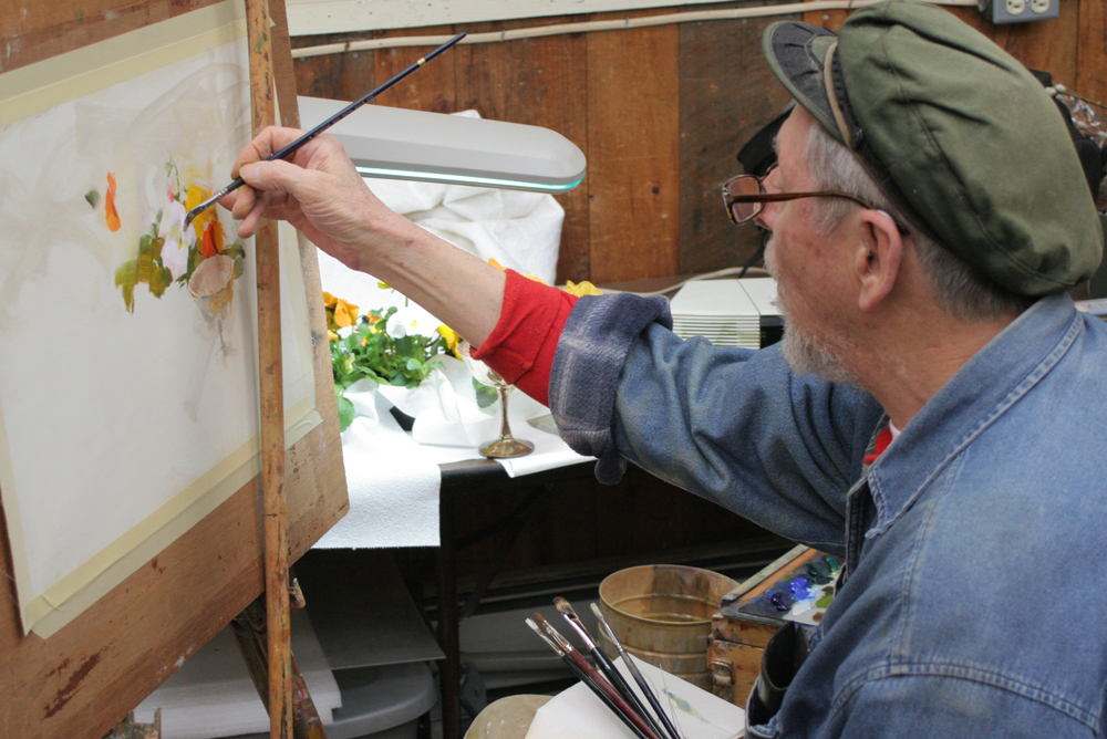
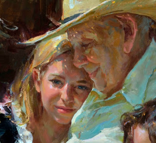
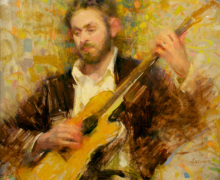
I had the great opportunity this past fall to meet 
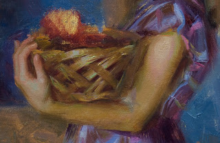
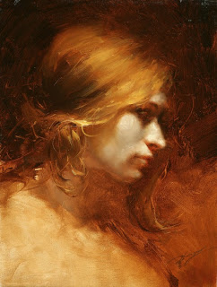
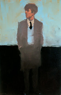
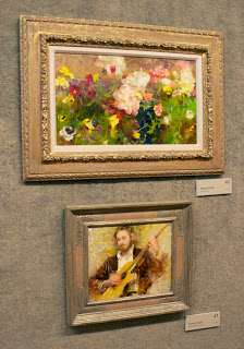
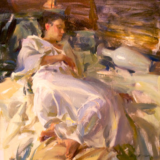
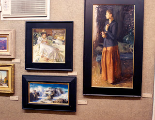
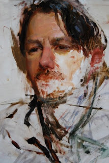
CW Mundy and to watch as he gave a still life demonstration. CW doesn’t fit the typical artist mold (you know . . . artsy long-haired Frenchmen with a goatee and cup of espresso), instead, he is a kind, beach clothes-wearing man with a booming voice and down-to-earth character. Matching this personality are his paintings, which follow no Salon or traditional style, but are loose, impressionistic, and filled with moving color.


I have wanted to focus more of my posts on the actual techniques of modern painters, and CW is a great place to start. Below is part one of a demo that he (and his wife Rebecca) so graciously sent over so that we can visually see the steps and techniques that he uses. Part two will walk us through one of his paintings step-by-step.

Materials and Methods

Color pots:
In the upcoming part two, as well as at the demo I attended in the fall, CW creates “pots” or piles of colors. The pot colors are color values in the main subject areas that he needs to paint, and they are mixed prior to painting.

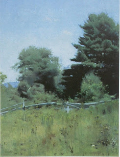
Take for example a typical landscape, you have the sky value and color as a mass, a mountain range as a different value and color mass, then you have the foreground as a different value and color mass. The logical thing to do is to makes piles of those 3 values, so you can do your painting without having to continually mix paint as you go. That will take you out of your “zone” if you have to continually mix paint for the masses.

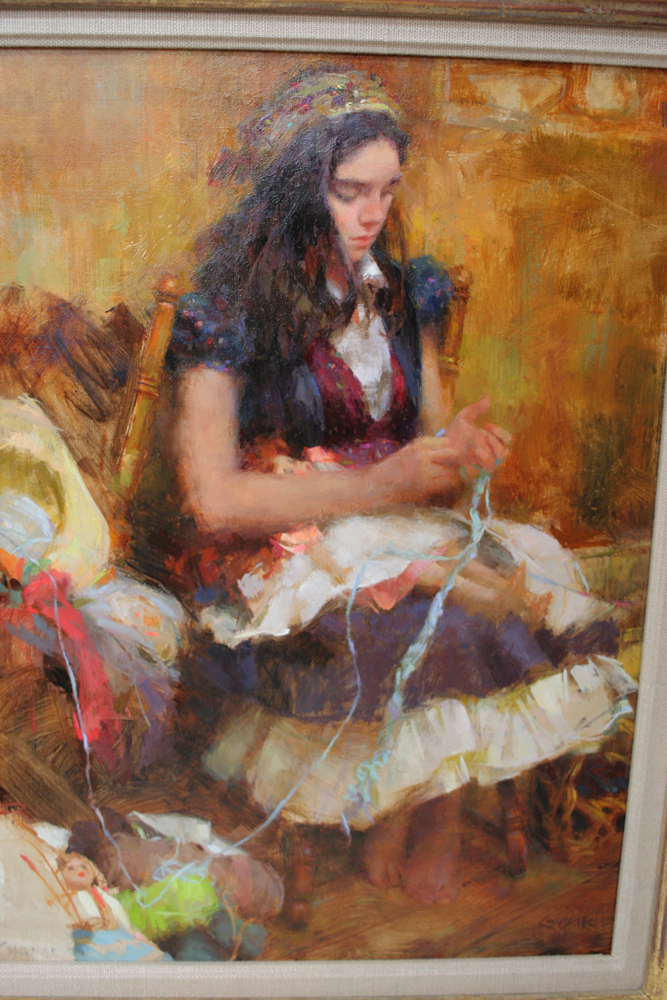
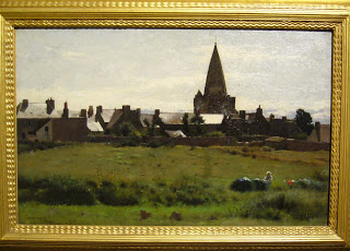
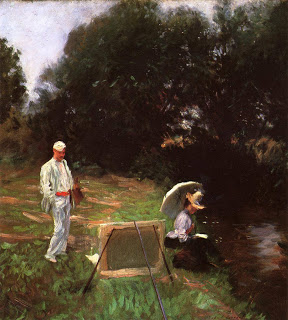
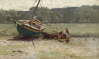
Bellagio, Lake Como 9 X 12

Also, there's a unifying factor that's crucial with color. Each pot color in this landscape is proportionally mixed with each mass color in the other two. In other words, the sky has some of the green from the foreground and some of the purple from the mountains. The green foreground will have some of the sky color and some of the mountain color in that pot. The mountain pot color will have the proportion of the foreground and the sky colors. This will unify the entire painting with color.

On location at Lake Como

Marbleized technique:
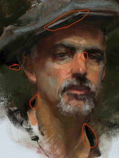
In addition to these loosely mixed pots of color, CW mixes paint in two main ways. The first is loosely mixing on the palette, either from modifying the pot colors, or creating a custom color. This mixing is done on the palette but as you can tell from his work, the colors are at most, folded color . . . never mixed together to form a flat color.


Now what is really exciting and important, besides just mixing paint on the palette, he will load up his brush with a pot color and then dip it into the pure chroma of the tube colors around the outer edge of the palette, stabbing various colors and picking up globs of paint that lay outside this main volume of pot color. Without mixing it, he will directly paint onto the canvas and thus "marbleize" the paint as he forms the stroke. He also finds that the effect is more easily accomplished using alkyds rather than straight oils, because alkyds have less pigment allowing them to marbleize better. Seeing this in person really blew my mind, I had never seen painting like this before and it seemed extremely exciting (and scary), but keep in mind that you need to know how and what color you are aiming for, if you get it wrong, you either have to scrap off the loads of paint, or add even more paint to edit your previous strokes.

Lighting:
When in the studio, CW generally lights his still lifes with warm light. As photographed in the post to come, he uses a high wattage tungsten floodlight. I’m not completely sure of the brand, but it looks like a 500-1000 watt unit that would probably cost a couple hundred bucks. He does not light his palette and canvas with the same light. He finds it is very important to have them always under natural light (in his studio, he has large windows behind him).

Palette:
CW paints with both standard oils and with Winsor & Newton Griffin Alkyds (Alkyds can be mixed with traditional oil colors, or can act as an underpainting, but should never be used above a layer of traditional oils. Alkyds dry with less elasticity and will cause cracking if above the more elastic, traditional oils.) In CW’s case, he either uses a full palette of one or the other.

Titanium White
Cadmium Yellow Light
Yellow Ochre (convenience color)
Cadmium Medium Red
Alizarin Crimson
Cerulean Blue
French Ultramarine Blue
Viridian
Terre Verte Green (convenience color)
VanDyke Brown
Dioxazine purple (convenience color)

(Notice the two pots of color here)

Tissues:
CW does not use paper towels to clean his brushes, instead he has a box of Kleenex tissues beside him for single use wipes. When he needs to wipe a brush, he grabs a tissue, wipes the brush, and then throws out the tissue. It’s fast, they are in a handy box, and are fairly cheap. Just don’t get the fluffy ones with all the lint and lotion.

Brushes:
Long-handled sable flat brushes: Rosemary 279 (but Langnickel 5590 will also work) – these are the brushes of choice for myself, and many of the “living masters.” The Rosemary’s are much more durable than the Langnickel, but both brushes create beautiful effects. They are fairly soft, and do take some getting used to compared to a hog bristle brush.

Various bristle flats and sable rounds

Go to Part Two of this post to read more

Painting Provincetown Video


Below is a video put together by Jon Goward and Paul Schulenburg. It is 35 minutes of interviews and conversations with the 12 artists that were a part of a group painting trip to the Cape this past Summer. Some of the artists include Jeremy Lipking, Ignat Ignatov, Stapelton Kearns, Michael Klein, Mark Hanson and many other well-known painters. This is the third year that this group (plus and minus a few) have gotten together, and the paintings have resulted in several shows and obvious friendships.

This video is a great way to learn more about some of these artists, and to get a glimpse of them working, I hope you enjoy it as much as I did.

The video can't be embedded here, so to view it, jump over to YouTube: Painting Provincetown

Painting Folder

I'm a bit of an art pack-rat, I have files, cd's, and shelves of art prints and books. If I'm not painting, I'm probably trying to get an art fix from looking through magazines and websites.

I love finding a new artist, or a painting that just blows my mind. Every artist is so unique and they take different approaches to their subject, their color choices, and even the way they mix and apply paint. That is why art is so great, each work is unique, there can never be another like it. The artists emotions, ideas, sensibilities and even brush hairs are in their paintings, and I find that so cool.

So, here a few recent additions to my art files:

Epiphany Portrait - Hal Yaskulka

Keira 16x12 - Hsin-Yao Tseng

Man in Blue 30x20 - Michael Carson


Pink Dress 16x12 - Hsin-Yao Tseng


The Cellist, 1908 - Joseph DeCamp

The Hug - Hal Yaskulka

Casey Baugh Updates


I was on Casey Baugh's site the other day and noticed a lot of updates that I thought I would make you aware of.


Casey just finished his first solo show with Wendt Gallery in NYC and his site has the 22 paintings from that show. I really loved Casey's previous paintings and some of these new ones aren't exactly my favorite, but there is no doubt that he is an amazing artist and perfect for the contemporary collector.


In addition to all the new works, he has added an archive section with a selection of his older paintings and drawings.


Casey has also started a new form of teaching through short videos. These videos walk you through one of his paintings and have in-process photos with voice-over. He is calling this "new" form of art demonstration Art Unlayered. I really like this concept and think that it could evolve into something great. For $15 each, these HD videos give you about 10 minutes of insight into his process. Below is a sample video from Casey (watch it on YouTube for the higher quality):

Not Far From Home - Daniel Gerhartz


This holiday season I received Daniel Gerhartz book, "Not Far from Home." It was self published and is offered through Liliedahl Video Productions (where his video demonstrations are also available). The book is 175 pages and co-written by Angela Sekerak, who studied a couple years behind me in art school and is equally a great artist and designer, helping Dan bring his work the presentation it deserves.


I used to work in both the publishing and printing industries, and I can say from experience that this book is one of the most beautiful and well-printed books that I have ever seen and definitely the finest in my library. It's cover is linen and gold-leaf and the interior printing has great color, a nice varnish on all the images, and the ink registration is spot on page after page. Kudos to The Fox Company, Lithographers, Inc. for a magnificent job on the production.


I have always enjoyed Daniel's paintings, but felt that sometimes they were to pastoral and maybe even cliche, but this book has changed my mind. Seeing them side by side and at a higher quality has put them in the category of timeless and masterful. He has accomplished a feeling of contemporary color and composition with century old brushwork and layering, and all this while working from life -- which he says is the one key to his success.


The book contains a forward by Richard Schmid, an intro by Dan, and a thorough biography by Angela. There are also 128 images, close-ups, studies, and one demonstration.


As a conclusion, this is one of the only art books that I feel is worth the cover price. I understand that because of shorter runs and self-publication that a lot of artists need to charge double or triple what you would expect from a large publishing house, but if Dan can create a book of this quality, everyone else should be able to as well. If your an artist or collector, you should have this book, and have it out so everyone can admire it.


Merry Christmas

I put this little video together for our friends and family, and if your reading this, then I consider you a friend.

From me and my family, I wish you a very Merry Christmas. Thank you.

Weekend with the Masters Videos

My friend Taaron Parsons has posted a few videos on YouTube from the "Masters" event. They are from a panel discussion where Richard Schmid, Scott Burdick, Rose Frantzen, Carolyn Anderson, Quang Ho, Sherrie McGraw, Dan Gerhartz and Jeremy Lipking spoke about the various advancements of technology and if they have positive or negative effects on art and artists.

I thought this discussion was great. I'm not sure if it's as exciting without being their live, but if you have an hour, it would be worth watching. Check out all the videos here.

And you can start with Part One below:


On a similar note, American Artist has released a special "Workshop" magazine that focuses on the "Masters" event. The price is fairly high at $20, but if you didn't have a chance to go, or you want a little keepsake if you did go, it might be worth the price. I initially thought the price was so high because of the included DVD, but the videos on it are more sales pitches than a documentary of the actual event.  If you do want it though, you should hurry to your local book store, my Barnes & Noble only had one copy left.